What’s more powerful, a word or an image? It’s a hotly debated topic in creative circles and cases have been made for both. Here’s our case for words:
When you read a word, your mind pictures the subject. Take “horse,” for example. Are you picturing a white horse or a black horse or a brown horse? Is it a stallion? A mare? A Clydesdale pulling a Budweiser stagecoach? Is it a racehorse? And if so, is it a thoroughbred (jockey on top) or a standardbred (jockey in a chariot behind)? Or maybe you picture horse the basketball game or horse the slang for heroin?
Point is, a word activates the mind and lets it go in any direction. An image is designed to contain no ambiguity. Yes, it’s helpful. But is it more powerful? Sure, everyone experiences an image differently, but they see the same thing. With a word, everyone sees something different.
So what can a good copywriter do with words?
In a word (two, actually): thought guidance. We use these words to elicit the right picture in the reader’s mind and the right emotion in their hearts. We get them to see the ideal state: the easier life, the better day, the more productive hour, the prettier date, the larger boat or the better food.
And then we use our words to create action. Pictures can’t do that — they can attract eyeballs but they can’t move hands. Only words can do that. The right words. At the right time. Arranged in the right way. And shown to the right people.
Think about this the next time a banner ad, brochure or billboard catches your eye. Think about how it made you feel, then think about what made you feel that way: the way it looked or the message it delivered.
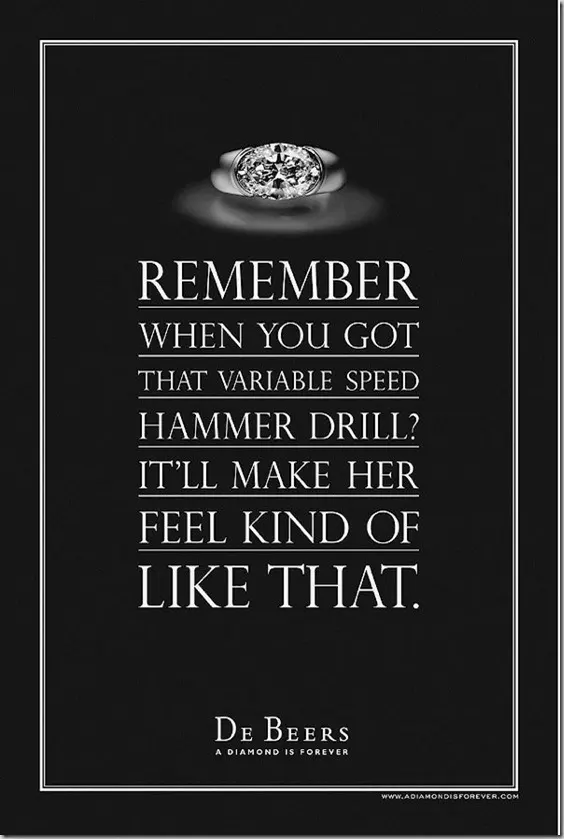
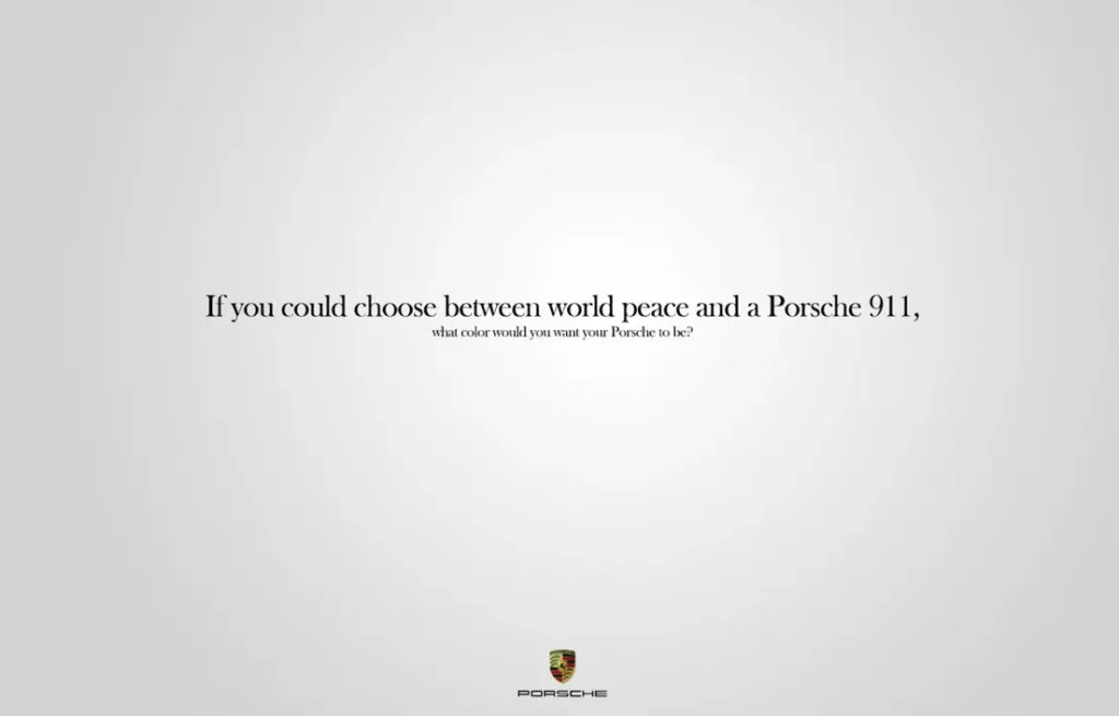
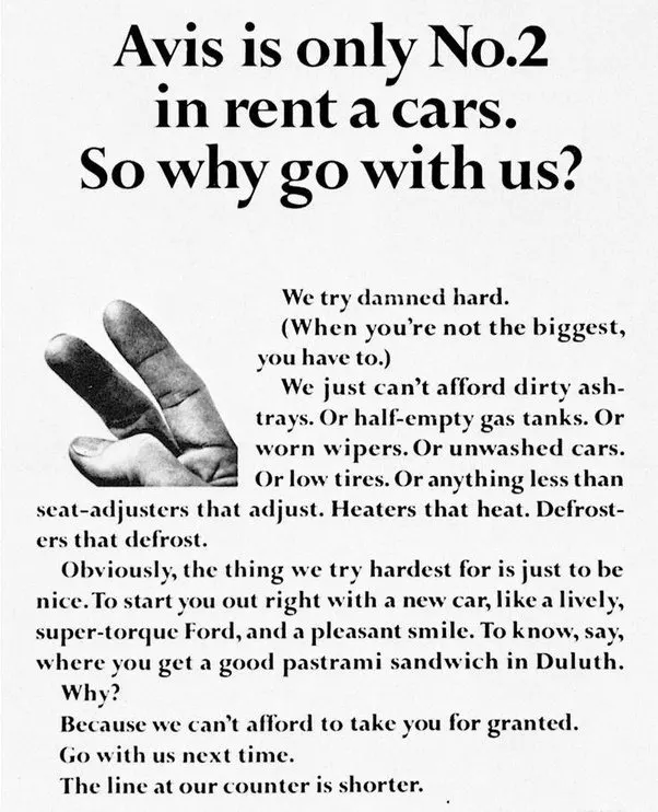
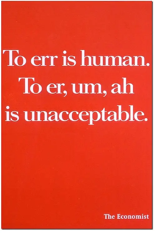
Here are a few that caught our eye over the years. We wish we wrote them all: